Information Material
Font sizes
For print publications, we use the font Myriad Pro. We recommend the following font sizes:
| Publication | Format | Continuous texts | Headings | Subheadings |
Leaflet, brochure | DIN long | 9 pt | 20 pt | 12 pt |
| Brochure, magazine | DIN A5 | 9 pt | 20 pt | 12 pt |
| Brochure, magazine | 21 x 21 cm | 10 pt | 24 pt | 17 pt |
| Brochure, magazine | DIN A4 | 10 pt | 30 pt | 18 pt |
| Poster | DIN A3 | 20 pt | 60 pt | 42 pt |
| Poster | DIN A2 | 30 pt | 85 pt | 60 pt |
| Poster | DIN A1 | 42 pt | 120 pt | 85 pt |
| Poster | DIN A0 | 60 pt | 170 pt | 120 pt |
For continuous texts, please use the font Myriad regular. The line spacing must be wide enough, for example 13 pt for a font size of 9 pt. In general, you should aim for a clean, classic and simple design.
Print publications
Flyers and brochures must have a minimum paper weight of 170g. Posters should have a minimum paper weight of 190g.
Multilingual Design
If you are planning to produce information material in several languages, we strongly advise you to create a separate leaflet, poster or brochure for each language variant. Bilingualism within one medium often leads to confusion and content overload. Furthermore, separate versions allow the content to be adapted flexibly to the respective target groups.
Brochures and flyers
Design guidelines for cover pages
The university logo must be placed in the upper left corner of the cover pages of all publications. It must always be embedded in the prescribed clearance area (see Clearance Area). As a rule, we use the blue logo on a white background (examples A and B). In exceptional cases, for example on a busy background, you may use the logo on a blue or silver background (see Clearance Area, example D). On one-color backgrounds, you may use a negative white of the logo, provided it is clearly legible (example C). A field colored in the university blue, the secondary color silver or the respective school color must appear underneath the cover image. This field must take up 30% of the total height of the publication. The heading is placed in this field. Credit: uc graphic
Example A  Credit: uc graphic
Example B 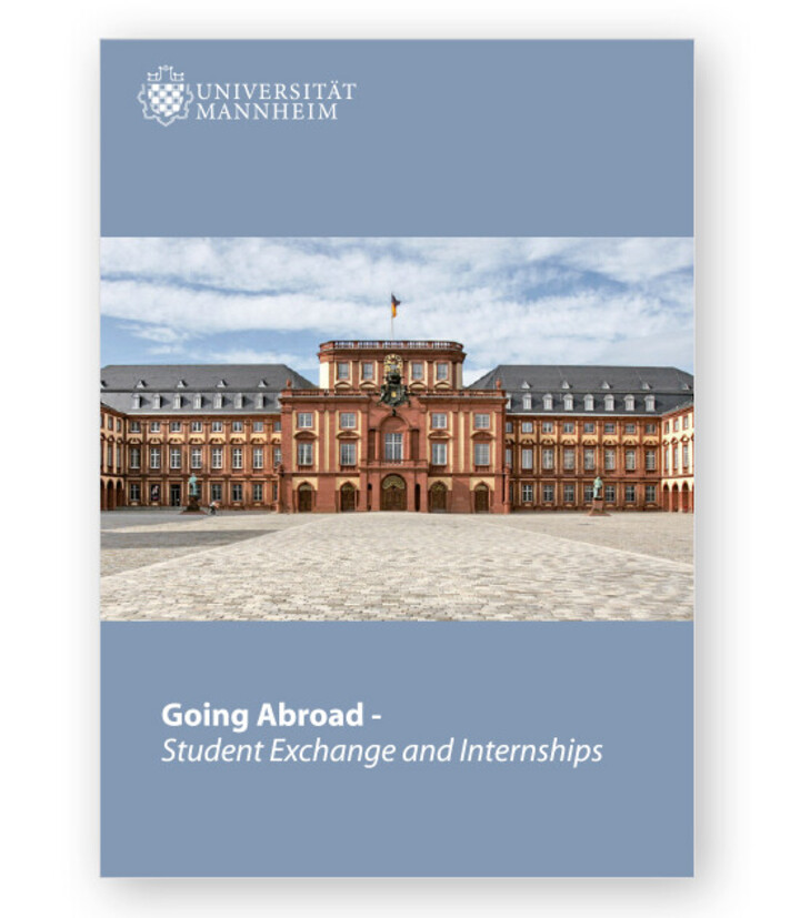 Credit: uc graphic
Example C 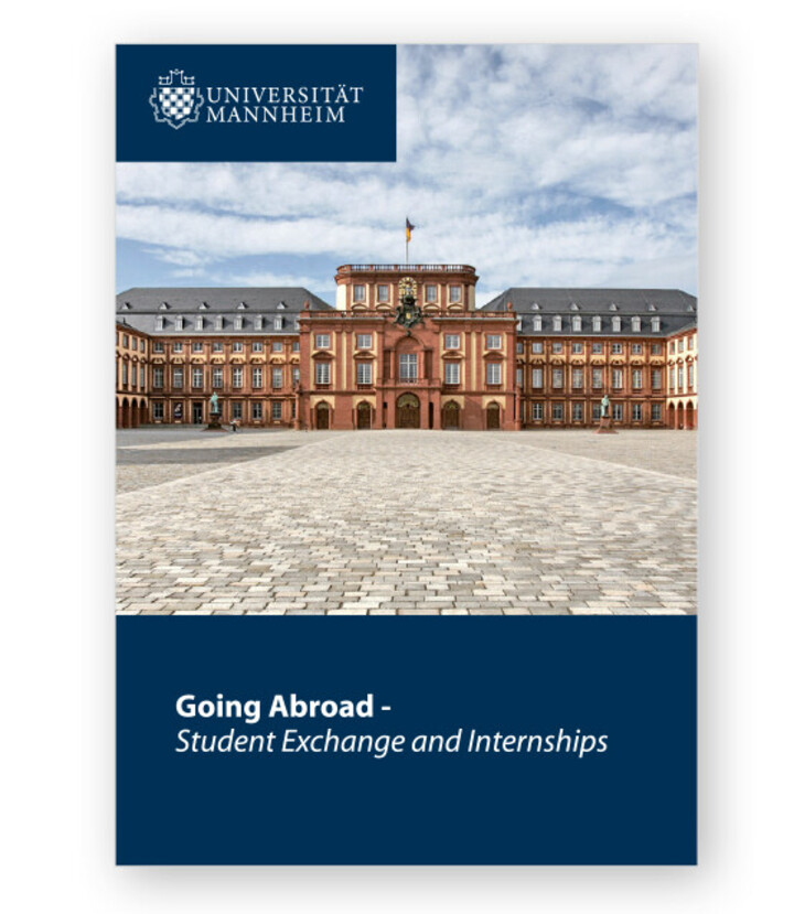 Credit: uc graphic
Example D Design options for cover pages
The size of the image should be determined depending on the format of the publication. You may either use a full-page image on which the protected logo appears in a clearly visible way (example D) or use a clear area in white, the university blue, silver or the school color above the cover picture (examples A-C). On busy backgrounds, the schools may use their logos with a white font in a clearance area in the respective school colors. You may place a color bar between the clear area and the image (examples A and B). The bar must have a width of two thirds of the format and a height of 1.8% of the total height of the publication. It may be colored in the school colors, silver or the university blue.Design guidelines for inside pages
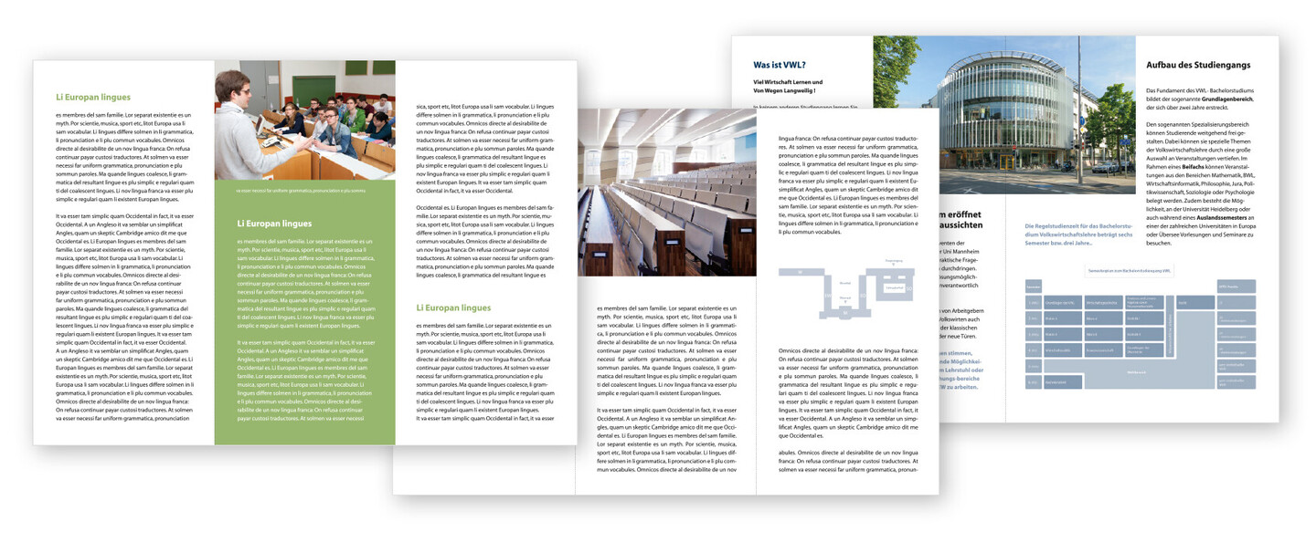
The color of the continuous text may vary: Apart from black, you may also use the university blue or white. Headings may appear in black, white, the university blue or the school colors.For continuous texts, you may use an italic or bold font, also in slightly different sizes.
 Credit: uc graphic
Posters
On posters, we also place the university logo in the upper left corner. It must always be embedded in the prescribed clearance area (see Clearance Area). As a rule, we use the blue logo on a white background. In exceptional cases, for example on a busy background, you may place the logo in a blue or silver field (see Clearance Area).
For the heading, we use the font Myriad regular/
bold. For subheadings and other text below the heading, we use the font Myriad regular. 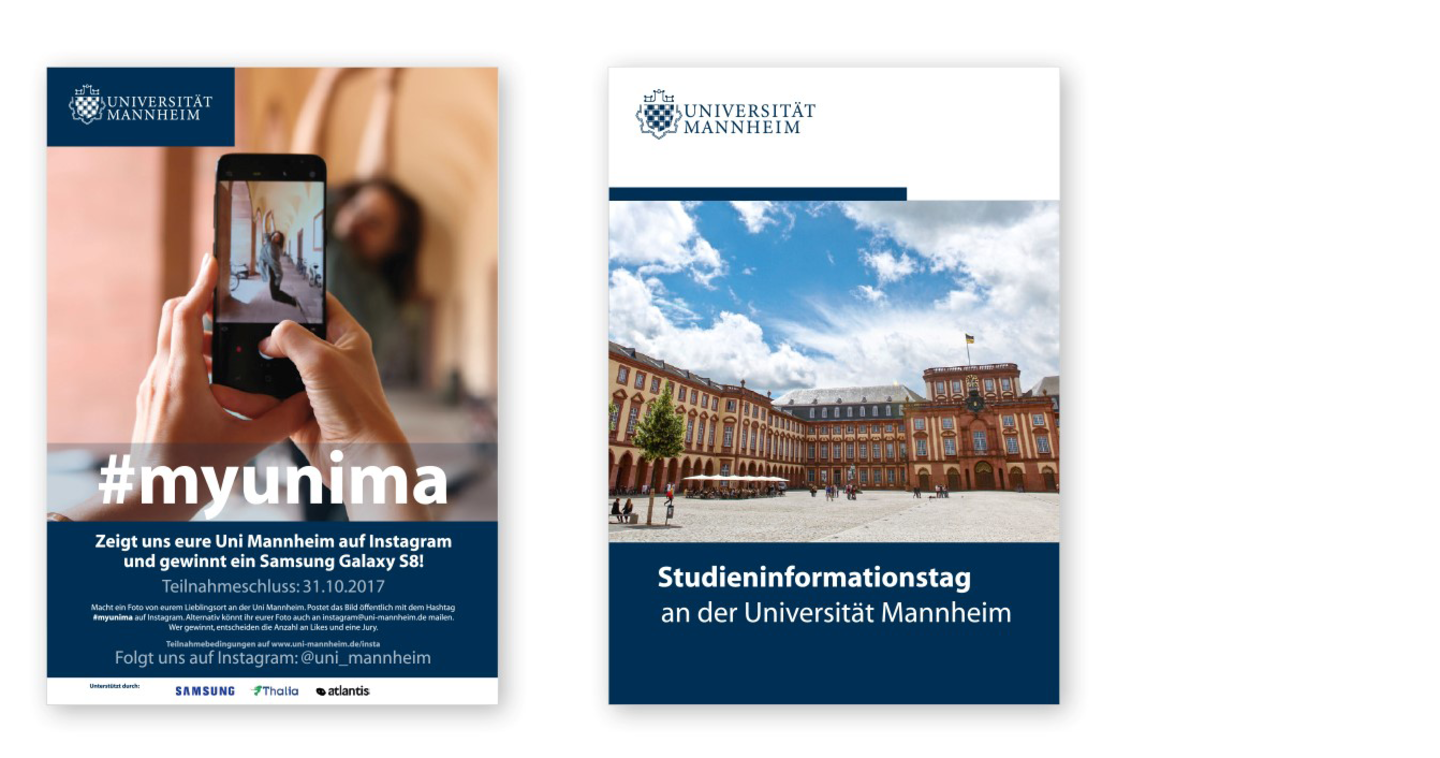 Credit: uc graphic